
Holt Design House

Holt Design House is a luxury interior design company that partners with a select number of families a year to design, build, and renovate turnkey residences.
brand design / messaging / web design

Visual Direction
We aimed to create branding that feels sophisticated and timeless, balanced by subtle warm details and a distinct personality. To accomplish this, we curated a neutral color palette with subtle pops of rich, warm colors.
Sophisticated / Warm / Timeless


For the HDH logos, we selected a typeface with a luxury feel and customized it to make it feel unique. We designed a timeless monogram symbol using the H.D.H initials and multiple badges to create versatility and recognition. In addition to the monogram & badges, we added subtle flora elements that add personality and deeper meaning.


The Team:
Studio Antheia:
Creative Direction: Morgan Brewer
Designer: Bethany Aekersberg
Ready to start your project?

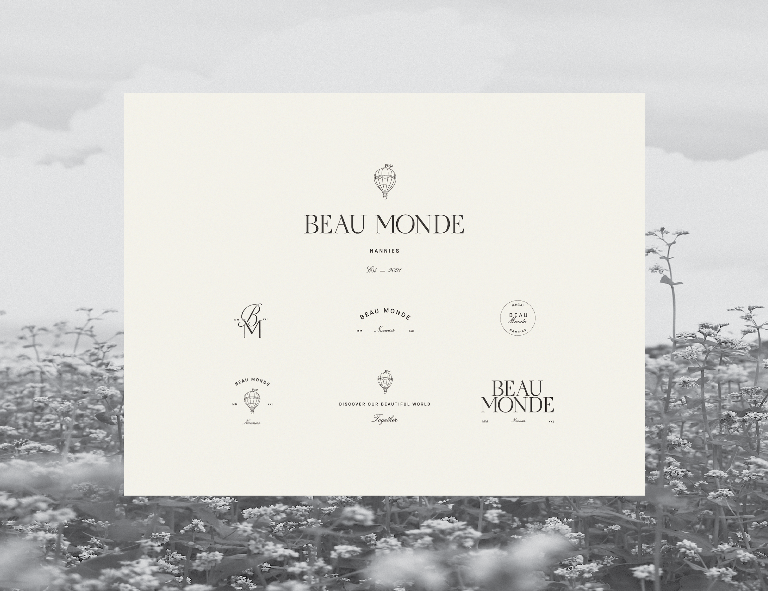
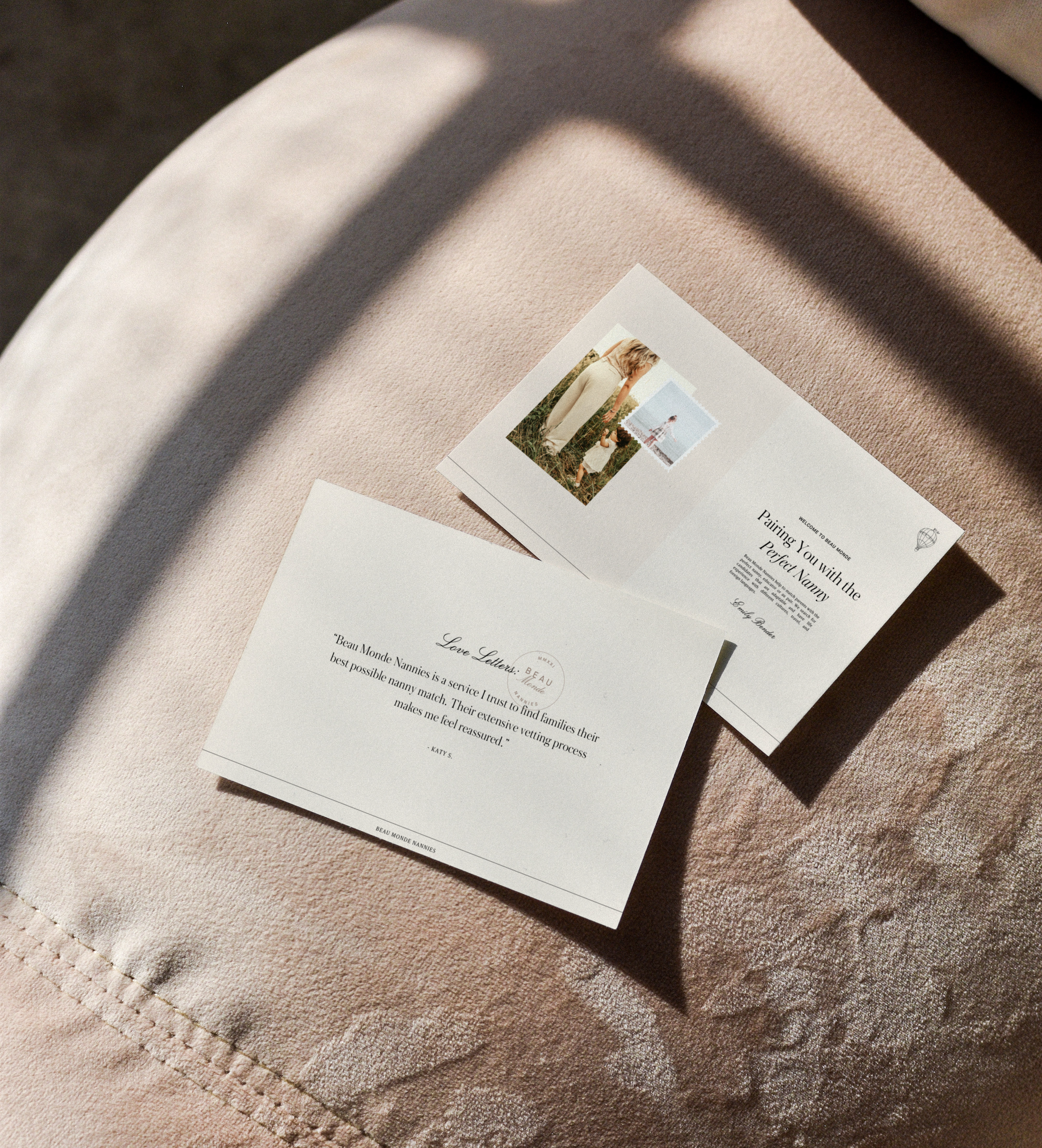
Beau Monde Nannies


Beau Monde Nannies is a nanny recruitment agency that helps parents find the perfect nanny, educator, or Au pair.
brand design / web design / collateral materials
Visual Direction
Our goal for Beau Monde Nannies was to create a brand that feels Luxe and elevated with a bit of whimsy.
We did this by creating an elevated wordmark and pairing it with a whimsical hot air balloon illustration that represents travel and whimsy.
Luxe / Whimsical / Cultured


The Team:
Studio Antheia:
Visual Direction: Morgan Brewer
Designer: Bethany Aekersberg
*Images curated via Pexels
Ready to start your project?

The Chandler Maker


The Chandler Maker is a modern candle company that provides hand-poured, small-batch luxury candles for the eco-conscious consumer.
brand design / web design / packaging / brand imagery

Visual Direction
We crafted a brand for The Chandler Maker that feels contemporary & elevated but is still full of heart-felt elements that embrace the small business and hand-crafted feel of The Chandler Maker.
Elevated, heartfelt, unique


We created a neutral color palette that reflects the organic nature of the TCM candles, while still remaining modern and timeless. The wordmark was designed using a strong san-serif typeface, customized in order to make it completely unique. We paired the wordmark with a beautiful and distinctive illustrative logo mark that reflects various values of the brand, along with a typographic badge that contains the initials of your brand name


The Team:
Studio Antheia:
Visual Direction: Morgan Brewer
Designer: Bethany Aekersberg
Messaging Strategist: Devon Loftus
Ready to start your project?

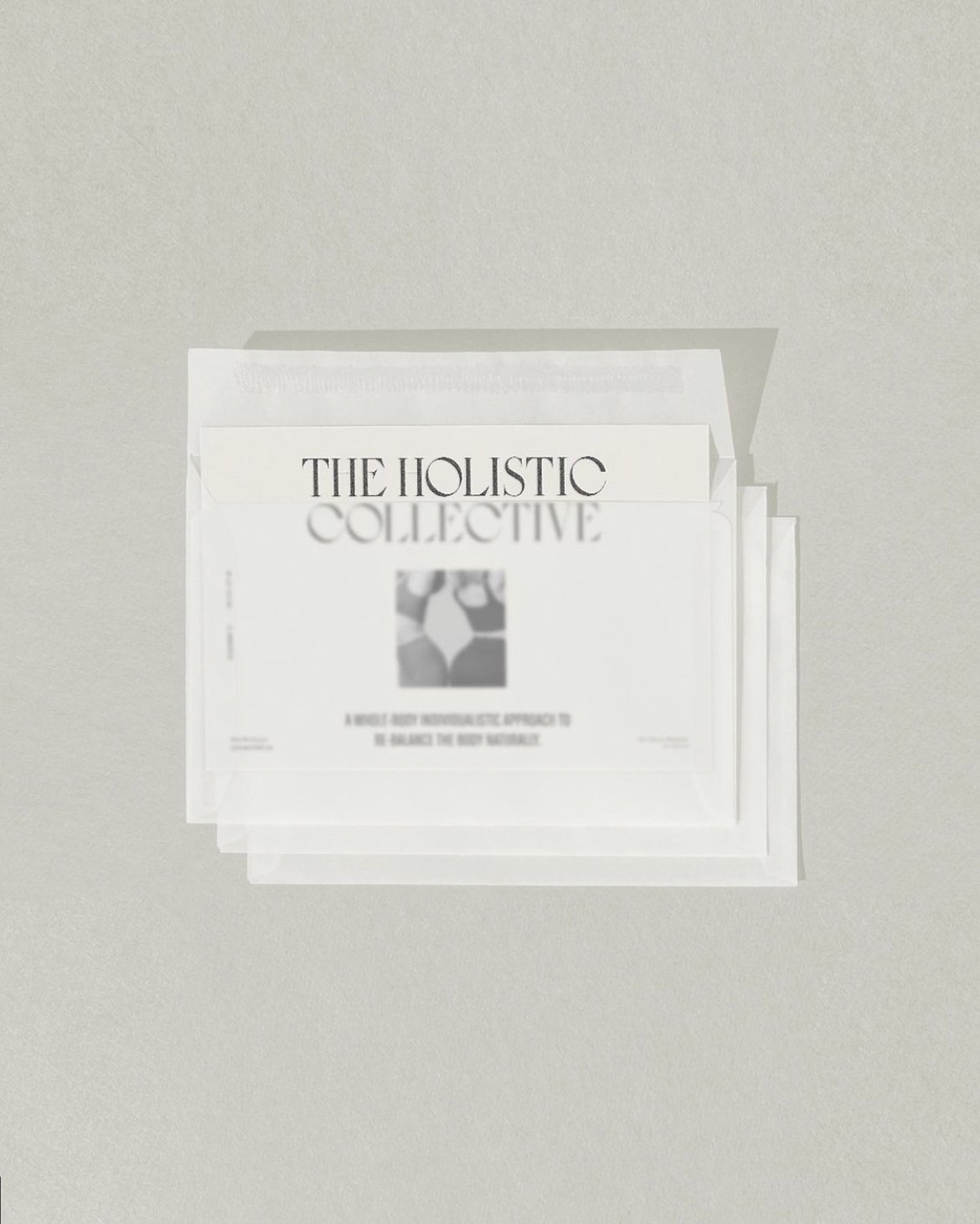
The Holistic Collective


The Holistic Collective is a modern health and wellness brand centered on a whole-body individualistic approach to re-balance your being from the inside out.
brand design / messaging / web design

Visual Direction
Our goal for the Holistic Collective was to create a brand that feels modern & elevated, yet still feels trustworthy and approachable.
We did this by combining elevated & strong typography with a soft brandmark and inviting copy.
Modern / Elevated / Holistic


For the primary logo, we created an elevated and modern design that looks timeless & luxe and has unique elements to set the Collective apart from their industry peers.


The Team:
Studio Antheia:
Visual Direction: Morgan Brewer
Designer: Bethany Aekersberg
Messaging Strategist: Devon Loftus
Ready to start your project?
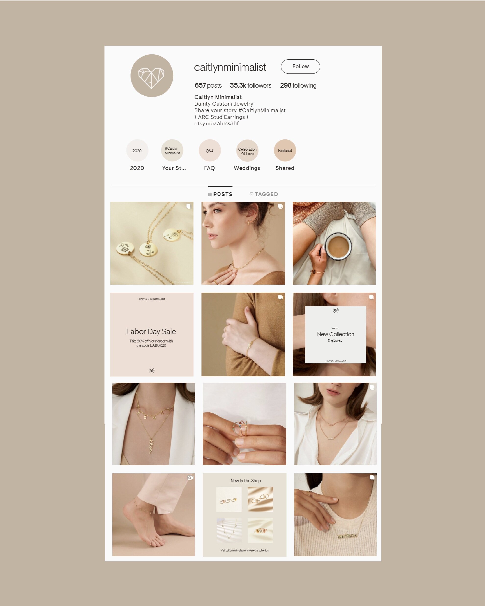
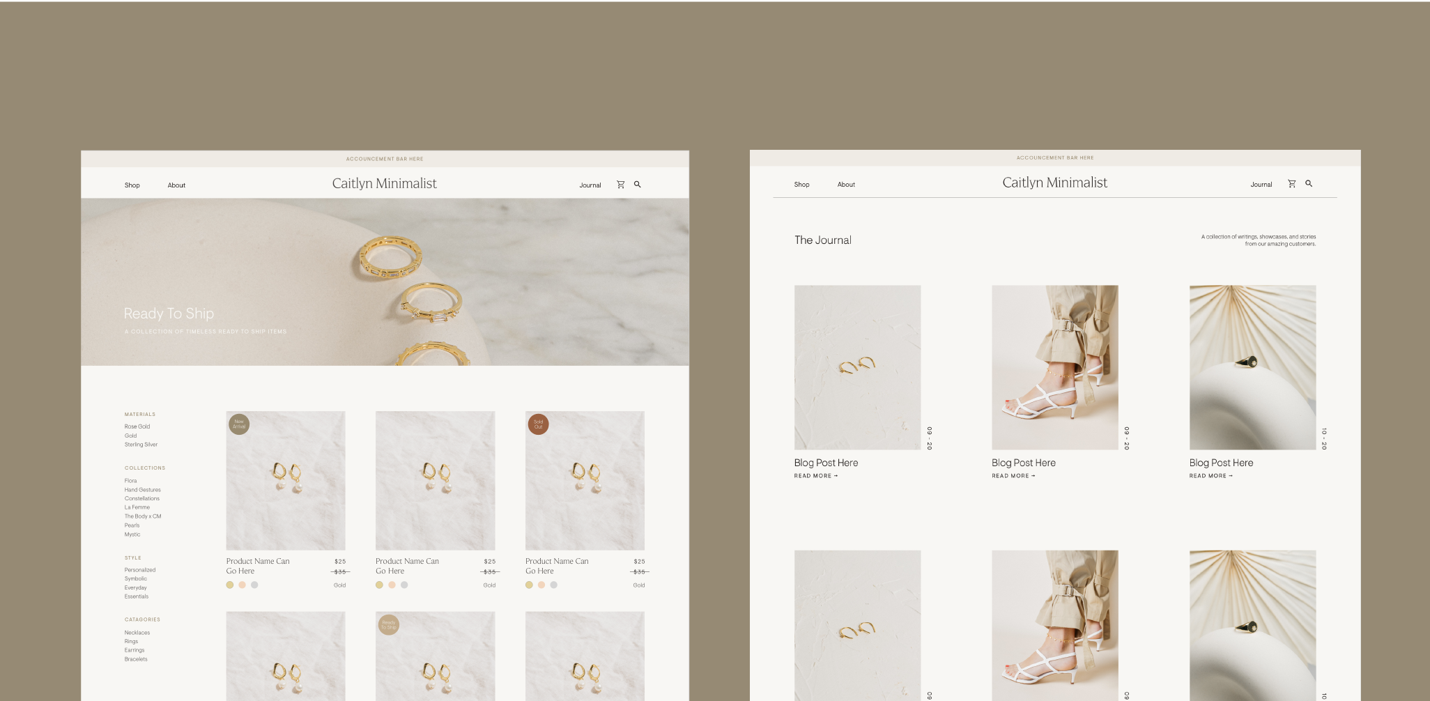
Caitlyn Minimalist


Caitlyn Minimalist creates dainty and timeless jewelry pieces that are designed to beautifully capture their clients unique style & stories. They are dedicated to providing high-quality adornments that are accessible to modern woman everywhere.

Visual Direction
The Caitlyn Minimalist branding is simplistic and modern with delicate touches of femininity. We want to celebrate this new chapter of your business by elevating Caitlyn Minimalist into a more mature and refined space, while still honoring the original branding that got them where are today.


We created the primary word-mark in lowercase letters which conveys the accessible and friendly nature of your brand. The dainty letterforms, customizations and the diamonds on the “i’s” mimic the feel of the Caitlyn Minimalist jewelry. For the brand symbol, we took inspiration from their original mark and created a simplified, more legible version. Inside the heart mark you with find a subtle “CM” as well as a ring.


The Team:
Studio Antheia:
Visual Direction: Morgan Brewer
Designer: Bethany Aekersberg
Messaging Strategist: Devon Loftus
Photography:
Beth Cath, Nicole Mason, Ellie

Lauren Elizabeth

Lauren Elizabeth inspires women to curate their best lives and embrace their best selves.
Lauren Elizabeth is a multidimensional lifestyle brand and business that encompasses honest conversations about life, style, and wellness for young women who are craving content that they can relate to. You provide your followers with a genuine and transparent look into your life, and by doing so you inspire them to truly embody who they are and embrace the raw and the real just like you do. Lauren Elizabeth is a place where women can go to get inspired, learn about home decor or the newest skincare, read refreshing content, and feel like their hanging out with a friend.


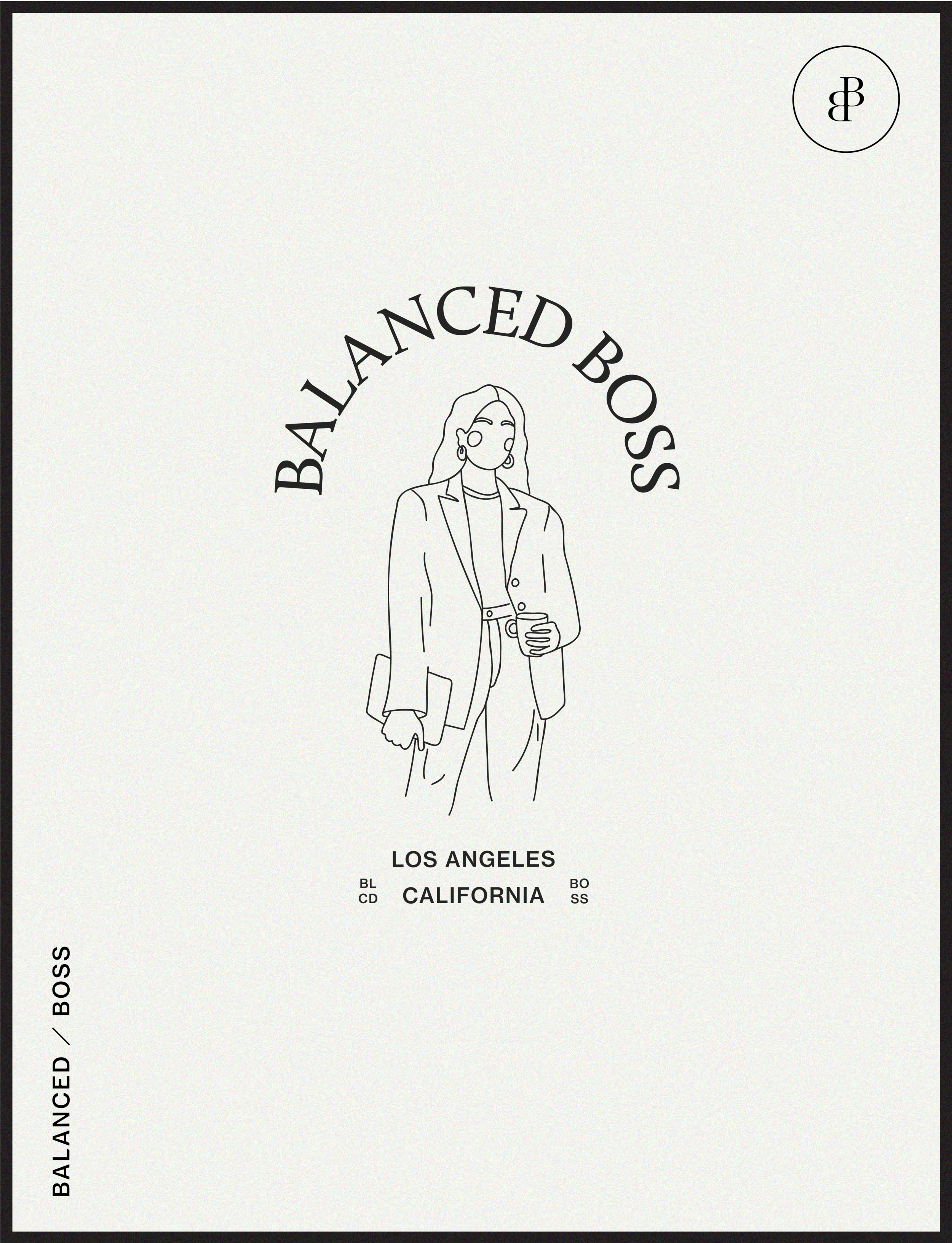
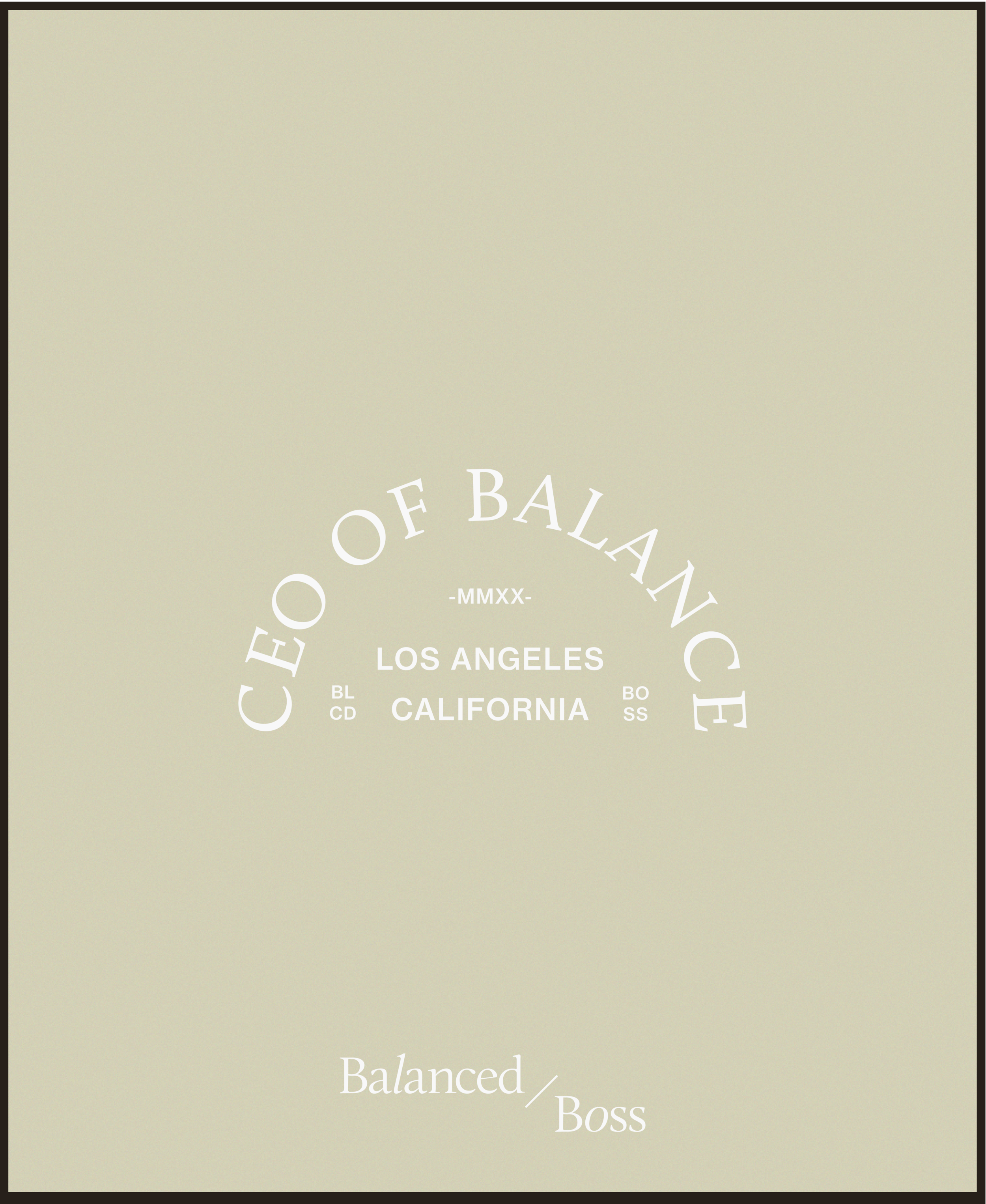
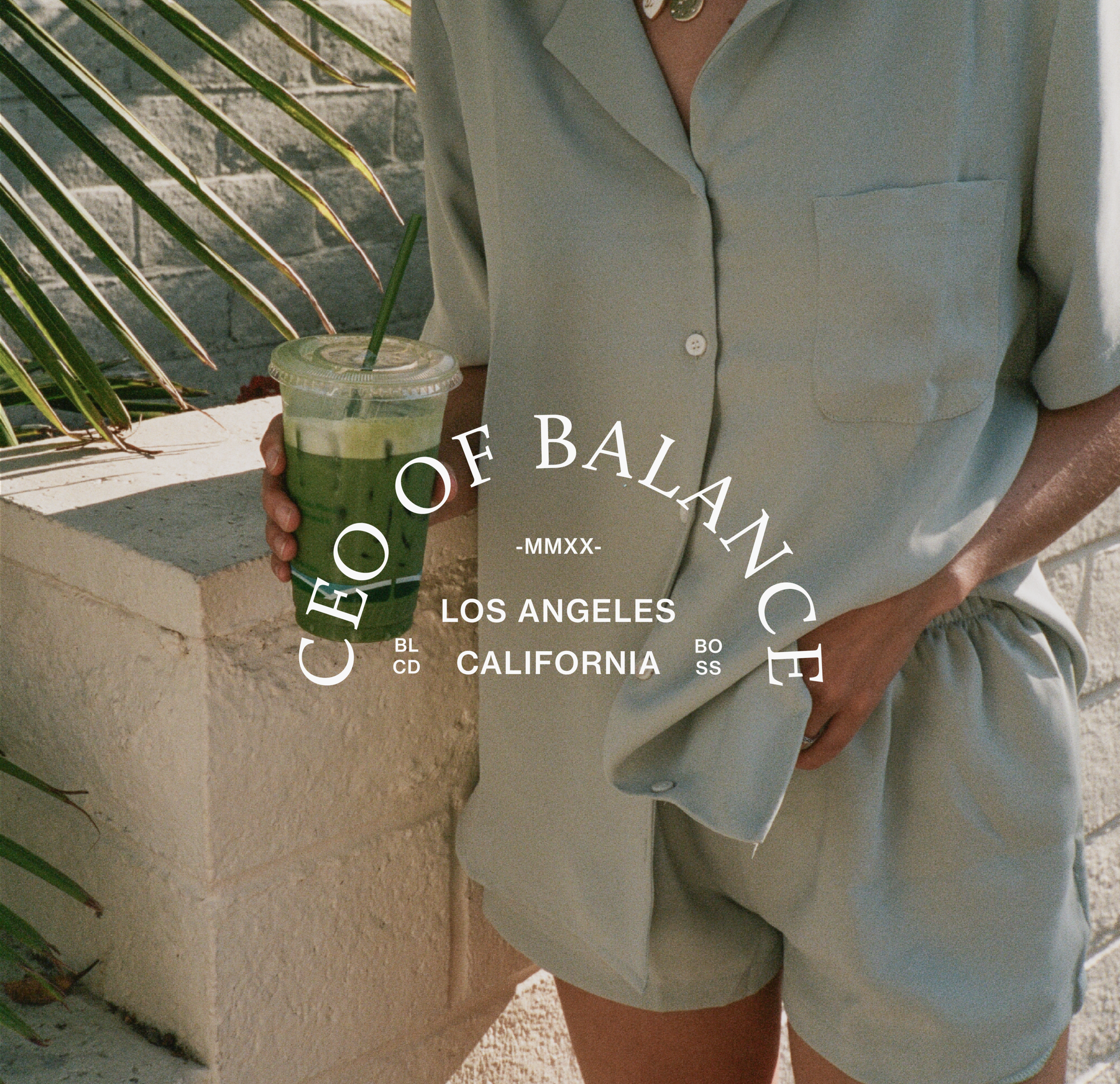
Balanced Boss

Balanced Boss
An Education platform providing online courses centered around self-improvement in the areas of business and health.
For Balanced Boss the goal was to create a brand that feels stylish, aesthetically pleasing and unique from any of the similar courses out there. We achieved this by using a neutral color palette, strong & stylish typography and customized marks and illustrations. Taking inspiration from high end brands, we customized the serif word mark to make it stylish and memorable. In addition to the word-mark, we created a family of design elements to to give the brand depth and versatility. While we wanted the primary elements to feel classic & timeless, wee wanted to bring in some supporting design elements that feel trendy, fun & relevant to their audience.